What can collaboration look like?
The virtues of collaboration in design are universally acknowledged, but what does collaboration actually look like? Who participates in the process?
Collaboration is especially crucial in laboratory planning and design, where end users have highly specific and technical spatial requirements. In today’s complex design ecology, prime architects and consultants such as engineers and laboratory planners work well with one another. How well the design team works with the end users, however, varies. Architects and lab planners want to support the scientific work of laboratory users, but the process of laboratory design does not always facilitate adequate information exchange and visioning.
Ideally, conversations with all relevant stakeholders at the programming stage – especially with users who spend the most time in the lab – will identify laboratory processes, needs and a “wish list.” Lab planners and architects then use this knowledge, as well as their experience with relevant regulations, trends and best practices, to define the program and create an initial design. Successive stages refine the design into detailed construction documents and specs. The more designers understand the end user’s needs and desires early in the process, the easier it is stay on schedule, avoid last minute changes and maximize functionality.
Establishing this shared ground and understanding between designers and users is crucial for project success, but multiple challenges hinder the building of this foundation. Roadblocks include:
- Crucial meetings between users and lab planners cut because of budgetary and schedule constraints.
- Lab users not feeling empowered or knowing how to share their knowledge and concerns with the design team.
- Projects not prioritizing the needs of laboratory users.
- In some lab types, the individuals with the most hands-on knowledge of the lab are often mission-critical personnel who do not have the availability for additional meetings.
When lab users do work with lab planners and architects early, the interaction is not always as productive or collaborative as it could be. For example, many users are not familiar with reading floor plans and elevations. The meeting may be their first time working on an architectural project and it can feel like the meeting is more about design experts telling the users what they need instead of the other way around.
Even when users recognize that they are the experts in their own laboratory practices, they may not know how to communicate their knowledge to the design team. Typical lab users are not trained to express spatial ideas. This communicative process – crucial to collaboration – is complicated by the fact that meetings are attended by so many stakeholders that it can be difficult to know when to speak. Time constraints mean that people get stuck on particular details and fail to address key issues and make necessary decisions.
An intervention to collaboration: HERA’s physical model
Lab planners play a crucial facilitator role in fostering collaboration with the users. Experienced lab planners can anticipate these roadblocks and communicative barriers and mitigate them before they arise. While multiple tools are available to help planners and lab users identify key processes, concerns and desires that would shape the design, HERA laboratory planners’ interactive physical model is a key case study in how to improve user-designer collaboration.
Conceived in a brainstorming session between HERA President Laurie Sperling and former HERA employee Dave Miller, the physical model seeks to make laboratory planning more intuitive for users who are not familiar with visualizing three-dimensional designs from typical two-dimensional drawings.
“The scale model is something they can put their hands on, imagining themselves walking through clearances and accessing amenities like safety showers and fume hoods, to really see it and feel it in real time.”
– HERA Principal Amy Tongay
Physical models have long been a part of the designer’s repertoire. Though some offices use physical “sketch” models as a way to develop building ideas, most designers deploy beautifully crafted “presentation” models in communicating to key decision-makers or even to fund raise. Virtual 3D models in Revit are now de rigueur in routine architectural office production tasks as they facilitate the management of building information datasets, allowing drawings to be quickly produced and helping prime architects and consultants collaborate with one another. Firms are also using virtual reality to immerse people in the experience of a future building.
All of these models, however, fail to meaningfully engage the information feedback loop that is central to user-designer collaboration. For many architects, user participation is often limited to selecting from several proposed building options. Revit models can be difficult for designers, let alone users, to learn to manage and control. Virtual reality is beautiful, but it turns users into audience members instead of participants. Finished models are meant to impress executives and donors, not to elicit feedback.
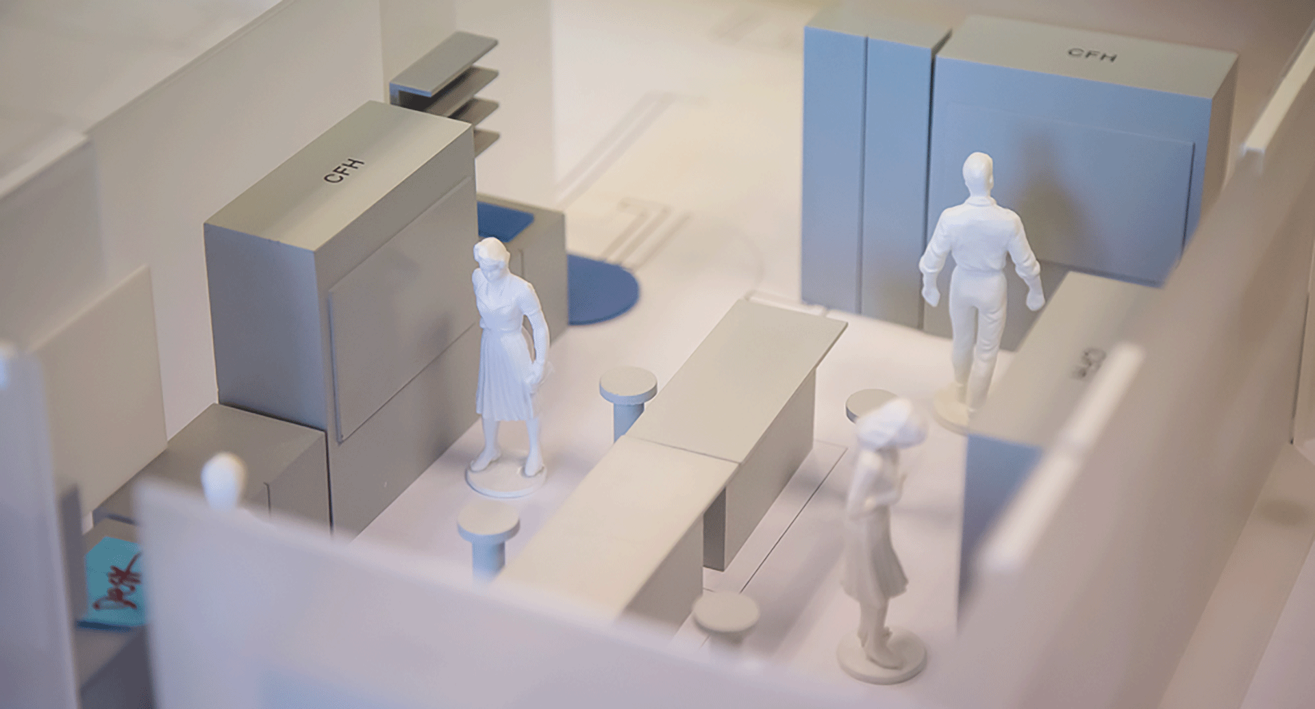
HERA’s model is different. Envisioned as a collaborative, interactive tool between planners and users, the model is composed of many typical laboratory components that can be assembled in a myriad of configurations. The kit includes translucent plastic wall panels of various lengths adapted to typical laboratory modules, tall gray blocks shaped as fume hoods and biosafety cabinets, black blocks signifying various equipment, tables, upper cabinets that hang from the walls, and even small blue squares that represent sinks. Set at a half-inch scale, the model is large enough to easily move pieces yet small enough that multiple lab modules can be built on a conference room table.
HERA’s physical model was designed with the laboratory user’s engagement in mind. At first, the model was a small kit developed for interviews to help clients understand laboratory design concepts and processes that are difficult to represent in two-dimensional drawings. Initial positive reactions from clients encouraged HERA to further develop the model, adding different components to the “kit of parts” that can be adapted for various laboratory types.
One of the first projects that deployed the physical model during interactive working sessions with users was a complex, multi-phase renovation for Reynolds Hall at Missouri Southern State University in Joplin, MO. Laboratories for multiple departments, including general chemistry, organic chemistry, general biology, microbiology, physics and geology – each with their own particular needs – were programmed and designed in real time with the user’s input. By using the physical model, HERA as able to work with each of the lab user groups to develop and refine design ideas quickly and efficiently.
“Most kids I feel like have had experience with Legos or something similar, and it’s that same concept … bringing out the physical pieces that look somewhat realistic and that goes back to the childhood experience of Legos. It’s just a lot more intuitive.”
– Lab Architect Matt Willmus
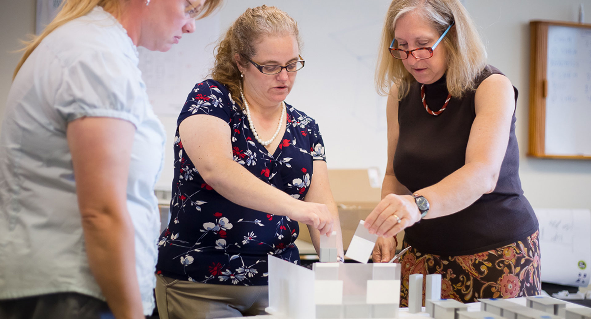
Because most end users have played with Legos, they intuitively know how to engage with HERA’s physical model. Unlike reading abstract architectural drawings, the barrier for participation is low. All it takes is a little prompting for users to start moving the pieces around and communicate their ideas to the designers. The model engages both the users’ sense of tactility and play, making it an ideal participatory medium.
Collective testing, experimentation and exploration
The design possibilities are seemingly endless in the beginning of a project. While architectural expertise and experience are key to identify which options do or don’t work, end user perspectives are critical because the design must address their specific needs. The interactive physical model helps the design team and end users narrow the number of options together. The results of even the smallest changes– shifting a wall here or moving casework there – is seen immediately, providing an instant feedback loop in creating and validating options. In the process of “test-fitting” programmatic requirements in the physical model, users immediately see the evidence of what works and doesn’t work. The transparency helps develop user consensus.
As Willmus says, the model “allows for experimentation and iteration much quicker, so rather than us sitting down and asking some questions and maybe sketch a plan where the users could suggest a few things, we can actually test the ideas very quickly and see if they are what they envision.” While planners can make changes on a drawing ‑ redlining them to show what the desired changes are ‑ it can be difficult to quickly test the three-dimensional impact.
In contrast, the physical “kit of parts” model allows users and planners to make multiple iterations very rapidly, using a few seconds to test out even minor ideas. The physical impact of each change is quickly revealed by the physical model. For example, shifting a divider wall can demonstrate changes to room sizes more vividly then seeing two additional red lines or an arrow indicating the shift being drawn. “It really helps solidify the proposals, which can go in a different direction than what the users or clients had wanted in the beginning. So, it helps validate the proposals that we show them, make some site improvements, better identify some details of the space, or make them realize they hadn’t mentioned something they might need,” Tongay said.
Moreover, the physical model puts the user in control of the process. As Eva Baker, HERA Associate and Philadelphia Office Director, observes, “the model changes who is holding the pen. The user can now make the changes, and this is part of what makes the model so powerful. It changes the dynamic in the room, shifting power from the architect as idea-generator and controller to the hands of the user, literally.”
Testing and validation sets this approach apart because it helps users to understand the many moving parts of each design decision. Users who have multiple design ideas of their own are empowered to express them and test them – by physically moving the pieces themselves – and the team can then work together to assess the pros and cons of each user proposal. Rather than solely relying on the planners to express their thoughts, users become part of the design team.
The art of facilitating user-planner collaboration
The model does not itself make the collaboration happen. It takes artful direction of experienced facilitators to allow the the model to shine.
Planners experience frustration when users don’t express a critical need until later in the design process, after many decisions have already been made. These revelations can prompt major design changes, causing project delays. Of course, users are not intentionally withholding information. While architects and planners have years of training, lab users don’t always know what issues can impact design.
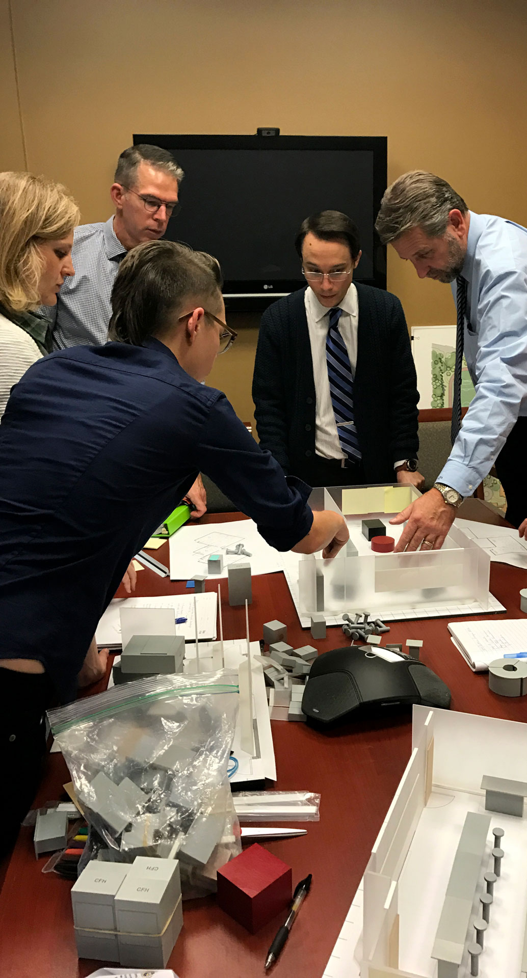
HERA’s physical model helps choreograph the collaboration between users and planners to anticipate and address such issues. Through years of experience, HERA planners have found that being intentional about when and how to use the model is critical. A key early lesson learned was to pair the physical model with floor plans scaled to the model. Not only does this process save time in the initial set-up – the plan becomes a literal footprint to indicate where each block goes – seeing the drawing and the model next to each other also helps the user understand the more detailed drawings they will be seeing later.
At times, the realities of code constraints or engineering needs can invalidate seemingly ideal solutions that the users and the design team spent time perfecting. Using scaled drawings in conjunction with the model, and bringing alternate proposed layouts that address critical issues, helps the design team avoid this problem. Facilitating – choreographing the user’s interaction with the model – is key to building consensus on issues like program locations and adjacencies.
“We take the first stab at the correct number of fume hoods and stations and come in with a design or two. We let them react to it, ask what doesn’t work, and prompt them to start moving the pieces around.”
– HERA Principal Amy Tongay
There is an order to using the pieces. “Start working from the big components in; getting the walls fixed, getting your circulation patterns, then filling in the more complex pieces such as fume hoods or biosafety cabinets, and then infilling with the smaller items,” says Tongay. This methodical approach allows the user-planner team to understand the geometry and structure of the room in relation to its future function while walking users through a roadmap of relevant architectural considerations.
Understanding rules, constraints and accessibility
Laboratories are subject to numerous codes and regulations that can seem arcane to even the most experienced laboratory professional. Compared to drawings, HERA’s physical model does a much better job at articulating these constraints spatially. Maintaining the lab’s accessibility is a key case in point.
A typical challenge with many lab users is the desire to add more equipment, casework and fume hoods to fill up the space.
“Folks start moving things closer than they should, which compromises circulation and safety,” said Equipment Planner Cy Henningsen. The solution: the hockey puck. “This red hockey puck looking thing represents a 5-foot circle. We are always aware that some of our users could be in wheelchairs or other mobility-assist devices, and the American with Disabilities Act requires there to be space in the room where someone in a wheelchair can turn around.”
“So, say we start off with the layout, and we work with the users for an hour to rearrange the lab, then we run this hockey puck through everything to make sure that things haven’t gotten squeezed.” The circular block – colored red so it stands out – helps users see required clearances. Testing with the model communicates what words could not.
“The act of running a red circular disk down the physical model illustrates to both users and the design team how the idea complies with regulations, cementing trust between users and design team. Also, we won’t be seen as the bad guy trying to tell them no,” Baker said.
Evolving the model alongside new laboratory trends
Like the work that happens in laboratories, the physical model is an evolving tool. Designing the pieces to withstand the wear and tear of travel, stabilizing the pieces, and learning to capture the design decisions were all challenges that the planners at HERA needed to address. Science and technology are also rapidly expanding fields, requiring the model to constantly adapt. New pieces are continually being added to fit the needs of a particular group of users or market sector.
“Sometimes you are designing for something more specific and tailored, like dental labs. You are going to have dental chairs and other equipment that are big enough to impact flows through the lab. We don’t have these as part of our normal model library, as something premade, but these pieces are an important part of the conversation with the users. That’s where 3D printing can come in. It adds the flexibility where we can pull from our existing 3D asset libraries in Revit or Sketchup and piggyback it onto the existing model,” said Lab Planner Cris Caruso. He is working on the model’s future iteration.
Tools like 3D printing allow HERA to create specialized pieces and human figures – updated to better represent the evolving diversity of the scientists and educators who work in the labs.
Takeaways for future users and designers seeking collaborative partnerships
Many architectural firms do not use this kind of low tech, high touch tool when interfacing with their clients and users. What can users do to get the most from work sessions with the design team?
- Anyone can have worthy design ideas. Identify key users of the lab and make sure they have adequate face time with laboratory planners to adequately flesh out current and future needs.
- Prepare for user-planner meetings by reviewing pre-circulated materials and brainstorming important issues. It may be difficult to articulate design flaws in your workspace, so document annoyances and hindrances as they occur so these issues can be brought to the architect and planner’s attention. Designers should make such “homework” accessible to the users, and users should do their best to respond to designer requests for information in a timely manner.
- Participate actively in the discussions. Lab managers should help users by organizing a list of potential topics of concern and planners and architects should empower users to propose different ideas. Whatever the medium, users should be prepped for what they will be seeing and doing in the meeting.
- Make sure both users and designers understand the consequences of each design decision. Taking all ideas seriously and explaining the pros and cons of each helps establish trust and consensus.
- Ask questions, especially if you don’t understand certain drawing conventions or codes and regulations. This may preempt missed communications down the line.


